Golden Age of Consumer Software
I've started using ARC, the hot new browser. It's really good!
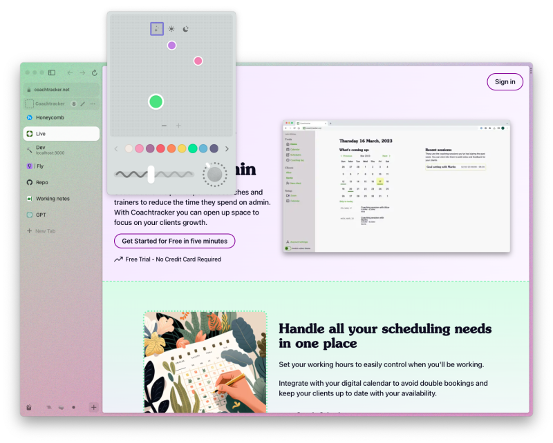
Under the hood it's Chromium - which means that the actual browsing is basically the same as you are used to. The UI surrounding the browser is the interesting part. Your tabs are pinned to the left of the screen. This frees up vertical space. It also reveals that the people who designed arc are super brain geniuses.
Why? Well, once you've seen it, it's obvious that browsers should be laid out this way. We're constrained on vertical screen space way more than horizontal. Seeing webpages render this way gives them a new beauty. But until I saw Arc this idea, obvious in retrospect, had never occured to me.
Arc looks nice
Beyond making webpages look better, Arc is itself somehow quite pretty. Things are laid out well. There is an appropriate amount of space between elements. You can customise the colours it uses per profile, setting gradients with an extremely sweet colour picker. It lets you make weird custom gradients from purple to green, but it also lets you add noise! And much like in music - adding noise always makes things better. Expect to see this popping up in a lot more products soon.

Kill all tabs
Arc treats tabs differently to other browsers, and aims to discourage the endless accumulation of pointless 'things that I need to read later' that plagues modern man. Your tabs are now split into two main groups - transitory ones, and permanent ones. The permanent ones have a sort of 'home url', to which they can easily return at any time. The transitory ones- which are the default for any new tabs you open -are automatically cleared after 12 hours. This, for me, makes working with a browser a much less brain hurting experience. I can pin the things that I actually return to, and let everything else disappear as and when.
Easels
Shareable moodboards which can have live webpages embedded into them?! This is a cool feature. Similarly to Apple's new Freeform it feels aggresively like 'not a thing normies would use', but maybe I'll be proven wrong here.
Boosts
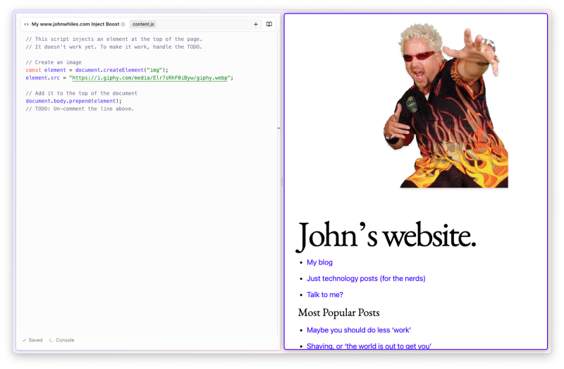
Boosts let you change websites as you see fit. Adding new CSS, removing content, embedding other pages inside them. Really it's a nice interface around building a local chrome extension - but that alone is a beautiful idea. It feels really empowering, like a great way for people to learn what web development is, and also just like what the web should be.
This is one of their examples. Great.

A golden age for software products
So why am I talking about Arc? Because it made me realise that we're in a golden age for software products.
You sometimes hear old heads talking about weird calendar apps which have vanished from the world, or how they loved Google Reader. Usually these were things I hadn't used, and these laments only ever gave me the vaguest sense of why the software in question was good. But there was a tolkeinesque sense of loss around this software. The Elves had left middle earth, their works were slowly giving way before the ravages of time and questionable aquisitions.
By comparison the consumer software that I used was almost without exception ill conceived and badly executed. This is still true today, and yet suddenly something in the world has turned1, and if you look in the right place there are really well made tools to be found. Look at the linears, arcs, and raycasts of this world, and compare them to the jankiness of most existing software. All these new things have meaningless names, and a dedication to quality.
What has caused this shift? I have no idea. But here are some ideas:
- Smaller teams can make good software products. These companies realised that and acted upon it?
- Notion made it clear that the market will reward considered design?
- Some new software tools- unknown to me -have made building good products easier?
As I said, I have no idea. I'll probably come back to this topic. If you see other software that you think fits into this mould, please let me know - as I'm keen to look at more examples.
1 I want to note that I'm specifically talking about tools that mainly target normies. There have always been great powerful bits of software made for engineers and computer geeks. But if you weren't the sort of person who wanted to use NeoVim you were, until recently, very poorly served.